
Lecture 10: Intro to Spatial Data#
Before we get into spatial data, let’s wrap up our conversation about regression! We’ll begin by loading in some of the project data.
import pandas as pd

immigration = pd.read_excel("population_characteristics_Toronto_2021_7.xlsx", sheet_name = "Immigrant Status", header = 9)
income = pd.read_excel("income_Toronto_2021_7.xlsx", sheet_name = "LICO-AT", header = 10)
asthma = pd.read_excel("AHD_Asthma_FY2022.xlsx", sheet_name = "Asthma_NHsTOR", header = [2, 3])
immigration_headers = ["Neighbourhood Name", "Population who are Immigrants (%)", "Population who Received Immigration Status Between 2011-2021 (%)"]
immigration_subset = immigration[immigration_headers]
immigration_subset.head()
income_headers = ["Neighbourhood Name", "In LICO-AT (%)"]
income_subset = income[income_headers]
income_subset.head()
asthma_top_headers = ["Neighbourhood", "Age-Standardized rate (/100) of Asthma (2021/22), All Ages 0+"]
asthma_top_subset = asthma[asthma_top_headers]
asthma_top_subset.head()
asthma_top_subset.columns = asthma_top_subset.columns.droplevel(0)

asthma_top_subset.head()
asthma_top_subset_headers = ["Neighbourhood Name", "Total"]
asthma_subset = asthma_top_subset[asthma_top_subset_headers]
asthma_subset.head()
df = immigration_subset.merge(income_subset, left_on = "Neighbourhood Name", right_on = "Neighbourhood Name")

df.head()
df = df.merge(asthma_subset, left_on = "Neighbourhood Name", right_on = "Neighbourhood Name")

df.head()
new_column_names = {
    "Neighbourhood Name": "neighbourhood",
    "Population who are Immigrants (%)": "share_immigrant",
    "Population who Received Immigration Status Between 2011-2021 (%)": "share_recent_immigrant",
    "In LICO-AT (%)": "share_low_income",
    "Total": "asthma_rate"
}

df.rename(columns=new_column_names, inplace=True)

df
Review: Correlation & Linear Regression#
We can investigate the correlation between two variables by plotting the two variables via .plot.scatter() and by using the function statistics.correlation().
As a reminder, possible values range from -1 (perfectly negatively correlated) to +1 (perfectly positively correlated), with 0 representing no relationship at all!
import statistics

statistics.correlation(df["share_immigrant"], df["asthma_rate"])
df.plot.scatter("share_immigrant", "asthma_rate")
If we want to better understand the nature of this relationship - how much an increase in the share of immigrants impacts the asthma rate - we can turn to linear regression.
This can be calculated in python using
ols().fit()from thestatsmodels.formula.apilibraryWe can print the key results from this table using
.summary().tables[1]
from statsmodels.formula.api import ols

model1 = ols('asthma_rate ~ share_immigrant', data=df).fit()

print(model1.summary().tables[1])
How can we interpret these results?
The model object contains several other useful attributes - let’s compare these side-by-side with the actual asthma rate!
.fittedvalues, which provides the values for \(y\) (asthma_rate) predicted by our regression line for each value of \(x\) (share_immigrant).resid, which provides the residuals - the remaining differences between the values predicted by our regression line and the actual values of \(y\)
pd.concat([df["asthma_rate"], model1.fittedvalues, model1.resid],
          keys = ["Actual Asthma Rate", "Predicted Asthma Rate", "Residual"],
          axis = 1)
We can see these values described visually on our scatterplot!
The fitted values can be used to describe the regression line (aka the “line of best fit”), shown in green.
Meanwhile, the residuals describe the vertical distance between that regression line and each individual point - effectively showing the amount of asthma rate that is not explained by our regression, shown in red.
import matplotlib.pyplot as plt

plt.scatter(df["share_immigrant"], df["asthma_rate"])
plt.plot(df["share_immigrant"], model1.fittedvalues, color="green")
# plt.vlines(df["share_immigrant"], df["asthma_rate"], model1.fittedvalues, color = "red")
Last time we described the regression equation as \(y = \alpha + \beta{x}\). However, because of these residuals, it is perhaps more accurately described as \(y = \alpha + \beta{x} + e\), where \(e\) represents all of the unexplained error not covered by the regression line.
Heteroskedasticity#
Ideally, we want these “residuals” to be fairly randomly distributed. If we see that larger values tend to have larger residuals, that would suggest that our model is biased towards overestimating larger numbers. This is called “heteroskedasticity”.
We can assess whether this is true by plotting a comparison between the fitted values and residuals from our model. In this case, it looks pretty random, which indicates “homoskedasticity” - that’s good!
plt.scatter(model1.fittedvalues, model1.resid)
regplot()#
Rather than pulling the fitted values from our model to obtain the line of best fit, we can also use a shortcut from the seaborn library called .regplot().
import seaborn as sns

sns.regplot(x = "share_immigrant", y = "asthma_rate", data = df, ci = 95)
This has the added advantage of allowing us to specify a “confidence interval” for our line. By default, the confidence interval is set at 95 (for 95%), but could easily be 90 or 99.
Confidence intervals for regression lines tend to be narrower in the middle and get wider towards the ends, because our estimates become less certain as we get further away from the means of the two variables
Let’s do the same thing for the share of low-income residents, and compare the results!
model2 = ols('asthma_rate ~ share_low_income', data=df).fit()

print(model2.summary().tables[1])
sns.regplot(x = "share_low_income", y = "asthma_rate", data = df)
Multivariate Regression#
We also have the option to combine multiple input variables into the same model, turning it into \(y = \alpha + \beta_1{x_1} + \beta_2{x_2} + e\). This will change the interpretation!
Intercept now represents the value of \(y\) (
asthma_rate) when both inputs are at 0%share_immigrantnow represents the effect of a 1 percentage point increase in % immigrants, if we hold the share of low-income residents constantshare_low_incomenow represents the effect of a 1 percentage point increase in % low income, if we hold the share of immigrants constant
model3 = ols('asthma_rate ~ share_immigrant + share_low_income', data=df).fit()

print(model3.summary().tables[1])
Comparing these three outputs, we can see that combining both variables into the same model reduces the effects of both of them. This is because the share of immigrants and share of low-income residents are related to one another:
Some of the impact of % immigrants on asthma rates is actually caused by the share of low-income residents!
Some of the impact of % low-income on asthma rates is actually caused by the share of immigrants!
print(model1.summary().tables[1])
print(model2.summary().tables[1])
print(model3.summary().tables[1])
Multicollinearity#
For this reason, we want to avoid including variables that are too highly correlated. If two independent variables are super correlated, it becomes very difficult to actually interpret what the effects mean!
General rule of thumb: steer clear of independent variables that have a correlation higher than ~0.7 (there is no fixed rule, however)
statistics.correlation(df["share_immigrant"], df["share_recent_immigrant"])
ols('asthma_rate ~ share_immigrant', data=df).fit().params
ols('asthma_rate ~ share_recent_immigrant', data=df).fit().params
ols('asthma_rate ~ share_immigrant + share_recent_immigrant', data=df).fit().params
As an exploratory step, pairplot() from the seaborn library can help you to investigate the existing correlations in your data:
sns.pairplot(df)
Adding variables to our model will always increase its explanatory power, which is reflected in the R-squared value (the percentage of variation in asthma rates that is explained by the model).
The share of immigrants only explains 9% of the variation in asthma rates
The share of low-income households explains 43% of the variation in asthma rates
The combined effect of immigrants and low-income households explains 45% of the variation in asthma rates!
print(round(model1.rsquared, 2))
print(round(model2.rsquared, 2))
print(round(model3.rsquared, 2))
Introduction to Spatial Data#
Spatial data are data that have a geographic dimension. A spatial data frame is pretty much identical to an ordinary data frame, except that it has an extra column that provides a geometry associated with each observation!
By locating things on a map, we can look at how different variables are distributed across space. This makes it possible to do things such as:
Identifying spatial patterns (such as clusters)
Examining the spatial relationships between different phenomena
Communicating data more effectively (a map often gets more attention than a graph!)

Types of Spatial Data#
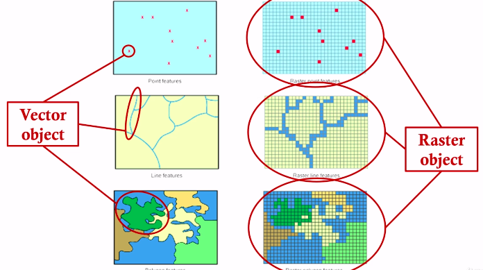
Raster data#
A surface of many many small squares (known as “pixels”) that each have a specific value.
These values correspond with some category (such as a particular land use, vegetation type, or colour from a satellite image) or value (such as elevation, or number of trees)
Google satellite view uses raster data!

Raster data are stored as a matrix

Vector data#
Discrete shapes that represent particular features that exist in space. Come in three varieties: points, lines, and polygons.
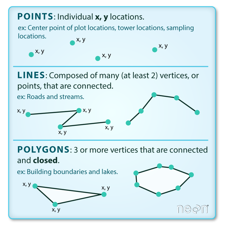
Vector data is stored in many different ways…
Some common file formats include geojson (.geojson), geopackage (.gpkg) and shapefile (.shp).
geojsonandgeopackagefiles are pretty simple - a single file that includes all of the spatial and non-spatial dataShapefiles (
.shp) are more complicated and involve multiple distinct files that contain information about spatial locations, coordinate systems and projections, attributes, etc, each in separate files. These files are a bit more cumbersome because they have to be kept all together, but they can be read into Python in exactly the same way!
Spatial files generally store spatial information about vector data in a specific format, which is contained in a geometry column:

Geopandas#
To read spatial data into Python, we can use the package geopandas. This works exactly the same as pandas, but for spatial data!
For example, we can use
gpd.read_file()to load in spatial data from a spatial file format, such as.geojsonor.shp
import geopandas as gpd

neighbourhoods = gpd.read_file("Neighbourhoods.geojson")

neighbourhoods.head()
A geopandas GeoDataFrame is the same as a normal DataFrame, with one important exception: it has an extra column named geometry
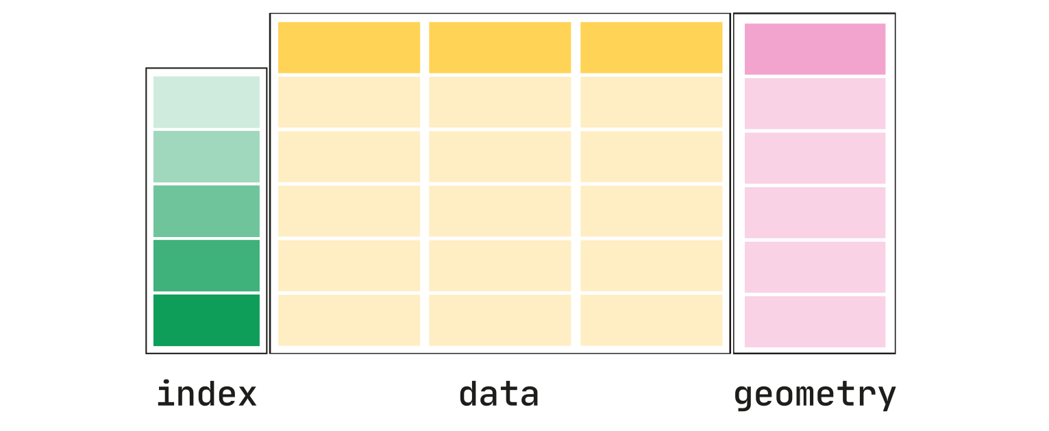
If we examine the contents of this geometry column, we can see that it looks a bit different that what we’re used to.
Each row contains the TYPE of vector geometry - in this case,
POLYGON- followed by a set of longitude/latitude coordinates.These sets of coordinates describe each node (point) outlining the boundary of a neighbourhood. If the neighbourhood was a perfect square, there would be four sets of coordinates: one for each corner!
neighbourhoods["geometry"].head()
Mapping#
Probably the most powerful thing about a geopandas data frame is that it makes it incredibly easy to map out your data!
You can simply “plot” a geodataframe and geopandas will make it a map!
neighbourhoods.plot()
We can customize this map in various ways!
neighbourhoods.plot(column = "CLASSIFICATION", legend=True)
neighbourhoods.plot(column = "CLASSIFICATION", legend=True, legend_kwds={"loc": "upper left"}, figsize=(12, 6))
neighbourhoods.plot(column = "CLASSIFICATION", cmap = "Set3", legend=True, legend_kwds={"loc": "upper left"}, figsize=(12, 6))
For a full list of possible values for cmap, we can look at the object colormaps from matplotlib:
from matplotlib import colormaps
print(list(colormaps))
For even greater customization of our plot - and to add multiple maps side-by-side - we need to use a different syntax to create our map, drawn from the matplotlib.pyplot library (abbreviated here as plt).
Specifically, we will use the function plt.subplots(), which requires that we provide the number of plots we want horizontally and vertically, as well as the overall figure size. This output is assigned to two objects, separated by a comma:
fig: A variable representing the overall figureaxes: A variable representing the subplots within the overall figure
First, let’s use plt.subplots to create a figure variable “fig” and an axes variables called “ax”.
The first line of code sets the stage - it says how many images - by rows/columns, and we can set other figure attributes in here, like figure size using figsize.
To plot the map, we need to call the plot command
.plotlike before, but this time we want to say which ‘cell’ or ax cell it will go in, i.e.,ax=axes.We also can use the
columnparameter to shade each row (that represents a polygon) by an attribute value.
import matplotlib.pyplot as plt

fig, axes = plt.subplots(1, 1, figsize = (12,6))

neighbourhoods.plot(column = "CLASSIFICATION", ax = axes, cmap = "Set3", legend=True, legend_kwds={"loc": "upper left"});
If we want to put two maps side by side, we can change the numbers in plt.subplots() to 1, 2, to indicate one row of plots and two columns.
We’ll map the
CLASSIFICATIONcolumn on the left-hand side by settingax = axes[0], andAREA_NAMEon the right-hand side by settingax = axes[1].We won’t add a legend to the right-hand side, because the legend would be bigger than the map itself!
fig, axes = plt.subplots(1, 2, figsize = (18, 6))

# Plot the first subplot with ax = axes[0]
neighbourhoods.plot(column = "CLASSIFICATION", cmap = "Set3", ax = axes[0], legend=True, legend_kwds={"loc": "upper left"})

# Plot the second subplot with ax = axes[1]
neighbourhoods.plot(column = "AREA_NAME", cmap = "Accent", ax=axes[1])
Mapping a separate colour for each observation generally isn’t recommended! It doesn’t provide us with any new information, and there aren’t enough unique colours. We can see that several colours are getting reused multiple times.
If we want to save our map into a file outside of our Jupyter Notebook (such as a .jpg or .png file), we can do via .savefig():
fig.savefig('torontomaps.png') #export maps as an image file!
Merging Spatial and Non-Spatial Data#
In order to take full advantage of this mapping capacity, let’s turn our attention to the data we were using earlier! We can use .merge() to join a spatial data frame with a non-spatial data frame in exactly the same way as normal.
neighbourhoods = neighbourhoods.merge(df, left_on="AREA_NAME", right_on = "neighbourhood")

neighbourhoods.head()
We can map a numeric variable using the exact same method! Below, let’s show two side-by-side maps of asthma rates by neighbourhood, using different colour scales: "YlOrRd", and "Greens":
fig, axes = plt.subplots(1,2, figsize=(20,5))

neighbourhoods.plot(column = "asthma_rate", ax = axes[0],
                    cmap = "YlOrRd", legend = True)

neighbourhoods.plot(column = "asthma_rate", ax = axes[1],
                    cmap = "Greens", legend = True)
Colour Palettes#
There are three broad categories of colour palettes for maps!
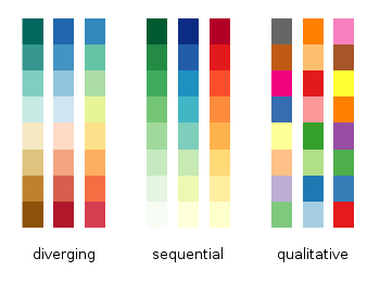
Qualitative colour palettes such as
"Accent"and"Set3"are designed to be used for categories, where numeric values are not important. These colour palettes try to create maximum contrast between categories, and avoid associating specific categories with being “higher” or “lower”“Sequential” colour palettes such as
"YlOrRd"and"Greens"use different levels of colour intensity to represent how small/large particular values areFinally, “Diverging” colour palettes, which include
"RdBu"and"RdYlGn"use two different colours to indicate the distance below/above some midpoint of the data
Diverging colour palettes are really effective in showing contrast between low and high values:
fig, axes = plt.subplots(1,1, figsize=(10, 5))

neighbourhoods.plot(column = "asthma_rate", ax = axes,
                    cmap = "RdBu", legend = True)
One potential problem with using colour scales is that people have particular expectations for what certain colours mean.
For example, people generally associate “red” with “bad”. However, while the default for
"RdBu"represents low values as red, people might expect high levels of asthma to be red because it’s a bad thing!We can reverse a colour scale by adding
_rto the end of it
fig, axes = plt.subplots(1,1, figsize=(10, 5))

neighbourhoods.plot(column = "asthma_rate", ax = axes,
                    cmap = "RdBu_r", legend = True)
What spatial patterns do you notice?
Classification Schemes#
These maps are displaying the range of values as a continuous gradient. This is fine for variables that are relatively evenly distributed, but it works less well for variables that are highly skewed!
For example, if we plot histograms of our three variables, we can see that while share_immigrant is relatively evenly distributed, asthma_rate is somewhat negatively-skewed, and share_low_income is significantly positively skewed!
fig, axes = plt.subplots(1, 3, figsize=(10, 5))

neighbourhoods.plot.hist(column = "asthma_rate", ax = axes[0])
neighbourhoods.plot.hist(column = "share_immigrant", ax = axes[1])
neighbourhoods.plot.hist(column = "share_low_income", ax = axes[2])
If we try to map out share_low_income, we can see the shortcomings of the default mapping approach.
There are only a few neighbourhoods with more than ~15% low-income residents!
While this map effectively highlights those low-income downtown neighbourhoods, it makes it much harder to interpret the variation across the rest of the city
fig, axes = plt.subplots(1,1, figsize=(10, 5))

neighbourhoods.plot(column = "share_low_income", ax = axes,
                    cmap = "RdBu_r", legend = True)
As an alternative, we can specify a classification scheme. Instead of setting colours according to a continuous gradient, classification schemes our data into a set of discrete categories representing ranges of possible values. There are three common classification schemes:
Equal Interval: Each category contains the same range of values (e.g. 5-10%, 10-15%, 15-20%, 20-25%)
Quantile: Each category contains the same number of observations - if there are 100 observations and five categories, for example, each category would get 20 observations
Natural Breaks: Breaks between categories are determined by a mathematical formula that identifies the largest gaps in the data
An equal-interval map will have the same problem as the gradient version: each category is the same width (4.62), which means that the lower categories are going to have most of the values
fig, axes = plt.subplots(1, 1, figsize =  (10, 6))

neighbourhoods.plot(column='share_low_income', scheme='equalinterval', k=5,
                    cmap='RdBu_r', ax = axes,
                    legend=True, legend_kwds={"loc": "upper left"})
A quantile map will look very different, because each category will contain the same number of observations. However, this also means that different colours represent radically different ranges: the middle category (in white) only ranges 0.72 from 7.58% to 8.3%, while the top category (in dark red) ranges all the way from 10.42% to 26%!
This also means that any outliers (such as the very high values in downtown) are obscured
fig, axes = plt.subplots(1, 1, figsize =  (10, 6))

neighbourhoods.plot(column='share_low_income', scheme='quantiles', k=5,
                    cmap='RdBu_r', ax = axes,
                    legend=True, legend_kwds={"loc": "upper left"})
Natural breaks (fisherjenks) gives us the best (and sometimes the worst) of both worlds:
Outliers are shown more clearly, but colours are being used more effectively to show the lower ranges of values
Each category still represents a different range of numbers, but they are more reflective of actual clusters of values in the data
fig, axes = plt.subplots(1, 1, figsize =  (10, 6))

neighbourhoods.plot(column='share_low_income', scheme='fisherjenks', k=5,
                    cmap='RdBu_r', ax = axes,
                    legend=True, legend_kwds={"loc": "upper left"})
Let’s compare all three versions of this map side-by-side! What do you notice?
fig, axes = plt.subplots(1, 3, figsize =  (24, 8))

neighbourhoods.plot(column='share_low_income', scheme='equalinterval', k=5,
                    cmap='RdBu_r', edgecolor='black', ax = axes[0],
                    legend=True, legend_kwds={"loc": "upper left"})

neighbourhoods.plot(column='share_low_income', scheme='quantiles', k=5,
                    cmap='RdBu_r', edgecolor='black', ax = axes[1],
                    legend=True, legend_kwds={"loc": "upper left"})

neighbourhoods.plot(column='share_low_income', scheme='fisherjenks', k=5,
                    cmap='RdBu_r', edgecolor='black', ax = axes[2],
                    legend=True, legend_kwds={"loc": "upper left"})

axes[0].set_title('Equal Interval Classification')
axes[1].set_title('Quantile Classification')
axes[2].set_title('Natural Breaks Classification')
Next Week#
Coordinate Reference Systems
Spatial Measurements (Area, Length, Distance Buffers)
Spatial Joins