2024 Final Exam Practice#
Below is the final exam with solutions in 2022.
In 2022, the exam is paper-based, so the answers to questions are in words instead of Python codes.
In this year, you will write Python codes to complete simliar tasks. The codes here may help you get familiar with what you will write in the final exam.
In addition, we will provide step-by-step instructions to help you write Python codes like the mid-term exam and your homework.
Therefore, we encourge you to go through the Python codes in this practice and try writing some codes by your own to see if you can reproduce the same results.
Final Exam Practice Session#
If you have any questions regarding this final exam practice, you might want to participate the following sessions held by Aisha and Mickey.
Aisha Syed’s session:#
April 15th 10:00am - noon
Join by Zoom link
Or Meeting ID: 854 7314 4952; Passcode: ggr274
Mickey Chen’s session#
April 16th 10:00am - noon
Join by Zoom link
Or Meeting ID: 842 6986 7370; Passcode: ggr274
Instructions#
In this exam, we will use information from the Toronto Health Profiles dataset and the Ontario Marginalization Index dataset.
We have made good use of both of these dataset this term but as a quick recap:
the Toronto Health Profiles dataset describes the rates of various diseases and health issues at the neighbourhood level across Toronto.
the Ontario Marginalization Index dataset provides a number thaat represents the level of social marginalization in each Toronto neighbourhood. Marginialization is defined as a combination of material deprivation, residential instability, dependency, and ‘ethnic concentration’.
While there are a number of diseases in the Toronto Health Profiles dataset, for this exam, we will focus on chronic obstructive pulmonary disease (COPD), which is a long-term lung condition that makes it hard for you to breathe. We will use the variable describing the percent of adults age 35+ who have COPD in each neighbourhood.
A data scientist wants to answer the following questions by conducting 4 different analyses:
Do neighbourhoods with higher levels of marginalization have higher precentages of adults with COPD?
Is there spatial clustering of COPD in Toronto and if so, where is it?
Can we use a linear regression to model how the percent of adults with COPD relates to marginalization and the number of COVID-19 testing sites in a neighbourhood?
Question 1#
Do neighbourhoods with higher levels of marginalization have higher precentages of adults with COPD?
import pandas as pd
import matplotlib.pyplot as plt
import numpy as np

marg_neighb = pd.read_excel('1_marg_neighb_toronto_2006_OnMarg.xls',
                            sheet_name='Neighbourhood_Toronto_OnMarg', header=1)

important_columns = ['Neighb id ', 'Neighbourhood name ',
                     'POPULATION','ONMARG_COMBINED_Q']

column_names = {'Neighb id ': 'neighbID',
                'Neighbourhood name ': 'names',
                'POPULATION': 'population',
                'ONMARG_COMBINED_Q': 'onMarg'}

sub_marg_df = marg_neighb[important_columns]
renamed_marg_df = sub_marg_df.rename(columns = column_names)

print(renamed_marg_df.shape)

renamed_marg_df.head()
(140, 4)
| neighbID | names | population | onMarg | |
|---|---|---|---|---|
| 0 | 1 | West Humber-Clairville | 32252 | 2.4 |
| 1 | 2 | Mount Olive-Silverstone-Jamestown | 32127 | 2.4 |
| 2 | 3 | Thistletown-Beaumond Heights | 9928 | 2.8 |
| 3 | 4 | Rexdale-Kipling | 10725 | 2.8 |
| 4 | 5 | Elms-Old Rexdale | 9879 | 2.6 |
Answer the following questions related to the python code above.
Q
What is the full name of the text file that is read into the pandas DataFrame marg_neighb?
ANS: '1_marg_neighb_toronto_2006_OnMarg.xls'
Q
What is the purpose of header=1?
ANS: this tells us where the column header (name) information is.
Q
i)
What will be printed out when the following code is run? (1 mark)
ANS: list
important_columns = ['Neighb id ', 'Neighbourhood name ',
                     'POPULATION', 'ONMARG_COMBINED_Q']

print(type(important_columns))
<class 'list'>
ii)
What will be printed out when the following code is run? (1 mark)
ANS: dict
column_names = {'Neighb id ': 'neighbID',
                'Neighbourhood name ': 'names',
                'POPULATION': 'population',
                'ONMARG_COMBINED_Q': 'onMarg'}

print(type(column_names))
<class 'dict'>
Q
How many rows and columns are in the DataFrame renamed_marg_df? (2 marks)
ANS: 140 rows and 4 columns
Q
What is the name of the column specified by renamed_marg_df.iloc[:, 2]? (1 mark)
ANS: population
Merging the data#
Now we will bring in the Toronto Health Profiles data and join it with the Ontario Marg. data:
copd_full_data = pd.read_excel('1_ahd_neighb_db_ast_hbp_mhv_copd_2007.xls',
                            sheet_name='1_ahd_neighb_copd_2007', header=11)

sub_copd_data = copd_full_data[copd_full_data.columns[[0, 11]]]

column_names_copd = {'Unnamed: 0': 'neighbID',
            '% With COPD.2': 'percent_copd'}

renamed_copd_df = sub_copd_data.rename(columns = column_names_copd)

marg_copd_df = renamed_copd_df.merge(renamed_marg_df, on = ['neighbID'])
marg_copd_df

#sub_marg_df = copd_full_data[important_columns]
#renamed_marg_df = sub_marg_df.rename(columns = column_names)

#print(renamed_marg_df.shape)

#renamed_marg_df.head()
| neighbID | percent_copd | names | population | onMarg | |
|---|---|---|---|---|---|
| 0 | 1 | 6.6 | West Humber-Clairville | 32252 | 2.4 |
| 1 | 2 | 7.1 | Mount Olive-Silverstone-Jamestown | 32127 | 2.4 |
| 2 | 3 | 7.4 | Thistletown-Beaumond Heights | 9928 | 2.8 |
| 3 | 4 | 8.4 | Rexdale-Kipling | 10725 | 2.8 |
| 4 | 5 | 9.0 | Elms-Old Rexdale | 9879 | 2.6 |
| ... | ... | ... | ... | ... | ... |
| 135 | 136 | 10.0 | West Hill | 25632 | 2.8 |
| 136 | 137 | 7.9 | Woburn | 52461 | 3.0 |
| 137 | 138 | 8.7 | Eglinton East | 22387 | 3.2 |
| 138 | 139 | 8.2 | Scarborough Village | 15590 | 3.2 |
| 139 | 140 | 8.4 | Guildwood | 10026 | 1.8 |
140 rows × 5 columns
Question 1.5#
Here, we make a copy of the dataframe. The code in this question operates on a copy of the renamed marginalization dataset so that it doesn’t interfere with questions that come later.
marg_copd_df_copy = marg_copd_df.copy()
marg_copd_df_copy.head()
| neighbID | percent_copd | names | population | onMarg | |
|---|---|---|---|---|---|
| 0 | 1 | 6.6 | West Humber-Clairville | 32252 | 2.4 |
| 1 | 2 | 7.1 | Mount Olive-Silverstone-Jamestown | 32127 | 2.4 |
| 2 | 3 | 7.4 | Thistletown-Beaumond Heights | 9928 | 2.8 |
| 3 | 4 | 8.4 | Rexdale-Kipling | 10725 | 2.8 |
| 4 | 5 | 9.0 | Elms-Old Rexdale | 9879 | 2.6 |
Q
What type is marg_copd_df_copy['onMarg']?
ANS: Series
Q
The values in marg_copd_df_copy['percent_copd'] are percentages (0 to 100). For this question, we want a new column in marg_copd_df_copy called 'proportion_copd' that had the same information but as a proportion (0 to 1).
Which of the following code cells would create that column? Select all that apply.
ANS: A, C, and D
# A
copd_proportions = marg_copd_df_copy['percent_copd'] * .01
marg_copd_df_copy['proportion_copd'] = copd_proportions
marg_copd_df_copy.head()
| neighbID | percent_copd | names | population | onMarg | proportion_copd | |
|---|---|---|---|---|---|---|
| 0 | 1 | 6.6 | West Humber-Clairville | 32252 | 2.4 | 0.066 |
| 1 | 2 | 7.1 | Mount Olive-Silverstone-Jamestown | 32127 | 2.4 | 0.071 |
| 2 | 3 | 7.4 | Thistletown-Beaumond Heights | 9928 | 2.8 | 0.074 |
| 3 | 4 | 8.4 | Rexdale-Kipling | 10725 | 2.8 | 0.084 |
| 4 | 5 | 9.0 | Elms-Old Rexdale | 9879 | 2.6 | 0.090 |
# B
#copd_proportions = marg_copd_df_copy['percent_copd'] ÷ 100
#marg_copd_df_copy['proportion_copd'] = copd_proportions
#marg_copd_df_copy.head()
# C
copd_proportions = marg_copd_df_copy['percent_copd'] / 100
marg_copd_df_copy['proportion_copd'] = copd_proportions
marg_copd_df_copy.head()
| neighbID | percent_copd | names | population | onMarg | proportion_copd | |
|---|---|---|---|---|---|---|
| 0 | 1 | 6.6 | West Humber-Clairville | 32252 | 2.4 | 0.066 |
| 1 | 2 | 7.1 | Mount Olive-Silverstone-Jamestown | 32127 | 2.4 | 0.071 |
| 2 | 3 | 7.4 | Thistletown-Beaumond Heights | 9928 | 2.8 | 0.074 |
| 3 | 4 | 8.4 | Rexdale-Kipling | 10725 | 2.8 | 0.084 |
| 4 | 5 | 9.0 | Elms-Old Rexdale | 9879 | 2.6 | 0.090 |
# D
marg_copd_df_copy['proportion_copd'] = marg_copd_df_copy['percent_copd'] / 100
marg_copd_df_copy.head()
| neighbID | percent_copd | names | population | onMarg | proportion_copd | |
|---|---|---|---|---|---|---|
| 0 | 1 | 6.6 | West Humber-Clairville | 32252 | 2.4 | 0.066 |
| 1 | 2 | 7.1 | Mount Olive-Silverstone-Jamestown | 32127 | 2.4 | 0.071 |
| 2 | 3 | 7.4 | Thistletown-Beaumond Heights | 9928 | 2.8 | 0.074 |
| 3 | 4 | 8.4 | Rexdale-Kipling | 10725 | 2.8 | 0.084 |
| 4 | 5 | 9.0 | Elms-Old Rexdale | 9879 | 2.6 | 0.090 |
# E
#copd_proportions = marg_copd_df_copy['percent_copd'] / 100
#marg_copd_df_copy.iloc[:,'proportion_copd'] = copd_proportions
#marg_copd_df_copy.head()
Q
Consider this code. From the choices below, select the statements that are valid.
ANS: B, C
low_marg = marg_copd_df_copy['onMarg'] <= 2
low_marg_df = marg_copd_df_copy.loc[low_marg, :]
A. Variable low_marg refers to column 'onMarg' from marg_copd_df_copy.
B. Variable low_marg refers to a Boolean series that is True for 'onMarg' values that are less than or equal to 2 in marg_copd_df_copy and False otherwise.
C. Variable low_marg_df refers to a dataframe containing only the rows from marg_copd_df_copy where the 'onMarg' value is less than or equal to than 2.
D. Variable low_marg_df refers to the same thing as marg_copd_df_copy but with a new column called 'high_marg'.
Question 2#
The data scientist conducts further analyses below.
marg_copd_df.describe()
| neighbID | percent_copd | population | onMarg | |
|---|---|---|---|---|
| count | 140.0000 | 140.000000 | 140.000000 | 140.000000 |
| mean | 70.5000 | 8.965714 | 17805.450000 | 2.400000 |
| std | 40.5586 | 1.941288 | 8427.630364 | 0.557487 |
| min | 1.0000 | 5.800000 | 6493.000000 | 1.000000 |
| 25% | 35.7500 | 7.300000 | 11641.000000 | 2.000000 |
| 50% | 70.5000 | 8.650000 | 15210.500000 | 2.400000 |
| 75% | 105.2500 | 10.325000 | 21669.000000 | 2.800000 |
| max | 140.0000 | 14.200000 | 52461.000000 | 3.400000 |
marg_copd_df["percent_copd"].plot.hist(color = 'grey', edgecolor = 'black', bins = 10)
plt.title('histogram of percent copd')
plt.xlabel('perc. of adults with copd')
Text(0.5, 0, 'perc. of adults with copd')
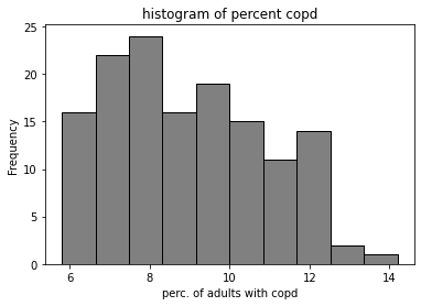
Answer the following questions using the code and the output above.
Q: The data scientist begins by examining the empirical distribution of the data.
Approximately how many neighbourhoods have a
percent_copdvalue between 8.65 and 10.325?
ANS: 35 neighbourhoods (25% of 140)
Q:
What does the mean of
percent_copdbeing higher than the median imply about the distribution of the data?
ANS: there are a few neighbourhoods with high values; or the distribution skews right.
marg_copd_df['high_marg'] = marg_copd_df_copy['onMarg'] > 2.4

marg_copd_df.boxplot(column = 'percent_copd',
                          by = 'high_marg',
                          grid=False);
plt.title('')
plt.ylabel('Percent of Adults with COPD')
Text(0, 0.5, 'Percent of Adults with COPD')
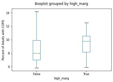
Answer the following questions by interpreting the code and resulting boxplot in the cell above:
Q
Is this statement true or false? The neighbourhood with the highest percentage of adults with COPD has an
'onMarg'value greater than 2.4.
ANS: FALSE
Compare the two medians. Rounding to the nearest integer (whole number), how much greater is the median “percent of adults with COPD” in neighbourhoods with higher levels of marginalization than the median in neighbourhoods with lower levels of marginalization?
ANS: ~2
Question 3#
Next, the data scientist would like to compare the percent of COPD in neighbourhoods with higher levels of marginalization (from column 'high_marg') with the percent of COPD in neighbourhoods with lower levels of marginalization. The data scientist conducts the following analyses.
def random_shuffle_mean():
    onMarg_HL_shuffle = marg_copd_df['high_marg'].sample(frac = 1, replace=False).reset_index(drop = True)

    perc_copd_low_shuffle = marg_copd_df.loc[onMarg_HL_shuffle == False, 'percent_copd'].mean()
    perc_copd_high_shuffle  = marg_copd_df.loc[onMarg_HL_shuffle == True, 'percent_copd'].mean()

    shuffled_diff = perc_copd_high_shuffle - perc_copd_low_shuffle

    return shuffled_diff
mean_table = marg_copd_df.groupby('high_marg')['percent_copd'].mean()
print(mean_table)

observed_mean_difference = mean_table.iloc[1] - mean_table.iloc[0]
print(observed_mean_difference)

random_shuffle_mean()
shuffled_diffs = []

for _ in range(1000):
    shuffled_diffs.append(random_shuffle_mean())

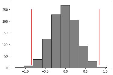
plt.hist(shuffled_diffs, color = 'grey', edgecolor = 'black')

plt.vlines(x = observed_mean_difference, ymin = 10, ymax = 250, color = 'red')

plt.vlines(x = -1*observed_mean_difference, ymin = 10, ymax = 250, color = 'red')
high_marg
False    8.563014
True     9.404478
Name: percent_copd, dtype: float64
0.8414639133101627
<matplotlib.collections.LineCollection at 0x7f85989e64c0>
def pvalue(shuff_diffs, obs_diffs):
    rightextreme_count = (shuff_diffs >= obs_diffs).sum()
    leftextreme_count = (shuff_diffs < -1*obs_diffs).sum()
    allextreme = rightextreme_count + leftextreme_count
    pval = allextreme / len(shuff_diffs)
    return pval

pvalue(shuff_diffs = shuffled_diffs, obs_diffs = observed_mean_difference)
0.009
Answer the following questions based on the code above.
Q In function random_shuffle_means, when we sample the data, we and set the replace parameter equal to False. Is the following statement true or false?
We are allowing rows to be sampled more than once.
ANS: False
Q: How many shuffled differences of means are generated in the code above?
a. 250 b. 10 c. 5000 d. 1000
ANS: d.
Q Consider this claim:
There is no difference in the percentage of adults with COPD between neighbourhoods with high
'onMarg'values and those with low'onMarg'values.
Is that the null hypothesis or the alternative hypothesis?
ANS: null hypothesis
Q: Given the p-value and a threshold of 0.05, do we reject or fail to reject the null hypothesis? (2 marks)
ANS: We reject the null hypothesis.
[PAUL QUESTION: does this give away the previous answer?]
[Michael answer: no, i don’t think so]
Q True or False: Using the method above, it is impossible to incorrectly reject a null hypthesis.
ANS: False
[PAUL COMMENT: ooh, this is a good question!]
Q Given the analysis above, would you say that neighbourhoods with higher levels of marginalization have higher percentages of adults with COPD? Yes or no.
ANS: Yes
Question 4#
Next, the data scientist would like to explore the spatial distribution of the 'percent_copd' column to understand if there is geographic clustering. They do the following analysis:
import geopandas as gpd
import mapclassify
import splot
import libpysal as lps
import esda
from splot.esda import moran_scatterplot
nbrhd = gpd.GeoDataFrame.from_file("Toronto_Neighbourhoods.geojson")

important_spat_cols = nbrhd.columns[[4, 5, 17]]
colnames_spat = {important_spat_cols[0]: 'name',
           important_spat_cols[1] : 'nbrhd_spat_id',
           important_spat_cols[2] : 'geometry'}

nbrhd_simple = nbrhd.copy()

nbrhd_simple = nbrhd_simple[important_spat_cols]
nbrhd_simple.rename(columns = colnames_spat, inplace=True)

nbrhd_simple["neighbID"] = nbrhd_simple["nbrhd_spat_id"].astype(int)

print('Before merge: ')
nbrhd_simple.head()
Before merge:
| name | nbrhd_spat_id | geometry | neighbID | |
|---|---|---|---|---|
| 0 | Casa Loma (96) | 096 | POLYGON ((-79.41469 43.67391, -79.41485 43.674... | 96 |
| 1 | Annex (95) | 095 | POLYGON ((-79.39414 43.66872, -79.39588 43.668... | 95 |
| 2 | Caledonia-Fairbank (109) | 109 | POLYGON ((-79.46021 43.68156, -79.46044 43.681... | 109 |
| 3 | Woodbine Corridor (64) | 064 | POLYGON ((-79.31485 43.66674, -79.31660 43.666... | 64 |
| 4 | Lawrence Park South (103) | 103 | POLYGON ((-79.41096 43.70408, -79.41165 43.703... | 103 |
nbrhd_simple = nbrhd_simple.merge(marg_copd_df, on="neighbID")

print('After merge: ')
nbrhd_simple.head()
After merge:
| name | nbrhd_spat_id | geometry | neighbID | percent_copd | names | population | onMarg | high_marg | |
|---|---|---|---|---|---|---|---|---|---|
| 0 | Casa Loma (96) | 096 | POLYGON ((-79.41469 43.67391, -79.41485 43.674... | 96 | 7.7 | Casa Loma | 9815 | 2.0 | False |
| 1 | Annex (95) | 095 | POLYGON ((-79.39414 43.66872, -79.39588 43.668... | 95 | 8.6 | Annex | 27482 | 1.8 | False |
| 2 | Caledonia-Fairbank (109) | 109 | POLYGON ((-79.46021 43.68156, -79.46044 43.681... | 109 | 11.0 | Caledonia-Fairbank | 10281 | 2.4 | False |
| 3 | Woodbine Corridor (64) | 064 | POLYGON ((-79.31485 43.66674, -79.31660 43.666... | 64 | 12.2 | Woodbine Corridor | 11550 | 2.0 | False |
| 4 | Lawrence Park South (103) | 103 | POLYGON ((-79.41096 43.70408, -79.41165 43.703... | 103 | 6.7 | Lawrence Park South | 14827 | 1.0 | False |
Q In the code, we created a new column 'neighbID' that is based on column 'nbrhd_spat_id'. Why did we do that?
ANS: nbrhd_spat_id contains strings and we need them as numbers to do the merge.
fig, axes = plt.subplots(1, 1, figsize = (12,12))

nbrhd_simple.plot(column='percent_copd', scheme='quantiles',
                  k=5, cmap='Greys', edgecolor='black',
                  ax = axes, legend=True,
                  legend_kwds={'loc': 4, 'title': 'Percent with COPD',
                               'title_fontsize': 16,'fontsize': 12})
<AxesSubplot:>
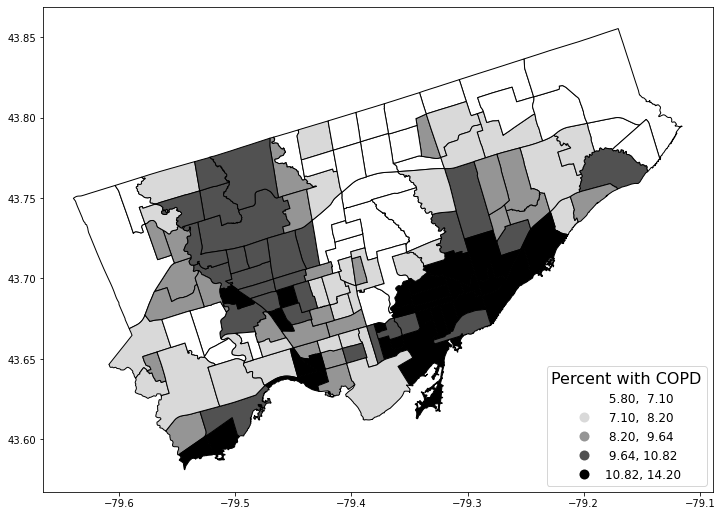
Answer the following questions based on the code above the map and the output.
Q How many “figure” objects are produced?
ANS: 1
Q How many “axis” objects are produced?
ANS: 1
Q Given the categorization scheme of quantiles and 5 groups, what are the percentile ranges for the five categories in the legend? (3 marks)
ANS: 0-20th percentiles, 20-40, 40-60, 60-80, 80-100
Next, the data scientist creates a weights matrix and conducts a cluster analysis.
w = lps.weights.Queen.from_dataframe(nbrhd_simple)
w.transform = 'R'

w[120]
{81: 0.16666666666666666,
 103: 0.16666666666666666,
 104: 0.16666666666666666,
 57: 0.16666666666666666,
 26: 0.16666666666666666,
 12: 0.16666666666666666}
Q The neighbourhood whose 'neighbID' value is 120 is neighbours with how many other neighbourhoods?
ANS: 6
# text-based histogram of the weights matrix
w.histogram
[(3, 9), (4, 13), (5, 31), (6, 40), (7, 25), (8, 13), (9, 8), (10, 0), (11, 1)]
Q Referring to the histogram in the output from the previous cell, how many neighbourhoods have exactly 10 neighbours?
ANS: 0
Q Referring to the histogram in the output from the previous cell, what is the most common number of neighbours our neighbourhoods have?
ANS: 6
[PAUL QUESTION: isn’t it 6?]
[Michael answer: yes! corrected]
mi_randNumCol = esda.Moran(nbrhd_simple['percent_copd'], w)

print('The Morans I value is: ', mi_randNumCol.I)
print('The p-value of this Morans I value is: ', mi_randNumCol.p_sim)
The Morans I value is:  0.6341562248493351
The p-value of this Morans I value is:  0.001
lisa = esda.Moran_Local(nbrhd_simple['percent_copd'], w)
splot.esda.plot_local_autocorrelation(lisa, nbrhd_simple, 'percent_copd')
(<Figure size 1080x288 with 3 Axes>,
 array([<AxesSubplot:title={'center':'Moran Local Scatterplot'}, xlabel='Attribute', ylabel='Spatial Lag'>,
        <AxesSubplot:>, <AxesSubplot:>], dtype=object))

Q What does the Moran’s I value of 0.634 imply about the spatial clustering of column percent_copd?
ANS: There is positive spatial autocorrelation or there is geographic clustering of this variable where high values are near high values and low values are near low values.
Q In the Moran Local Scatterplot, how would you describe the spatial context of neighbourhoods with points in the lower right quadrant (quadrant 4)?
Fill in the blanks: The neighbourhoods in this quadrant have 'percent_copd' values (greater than/lower than) the mean while their neighbours have 'percent_copd' values (greater than/lower than) the mean.
ANS: greater, lower
Q How would you describe the neighbourhood colored light blue on in the map in the centre in the previous cell, in the context of understanding how its 'percent_copd' value relates to its neighbours?
ANS: It has a value lower than the mean, while its neighbours have percent copd values higher than the mean.
Question 5#
Finally, the data scientist decides they want to model how the percent of adults with COPD varies by neighbourhood, accounting for both the Ontario marginalization index AND the number of covid-19 testing sites within neighbourhoods.
To do this, they will first conduct a spatial join and then compute a regression model.
covid19sites = gpd.GeoDataFrame.from_file('covid-19-testing-sites.geojson')
fig, axes = plt.subplots(1,1, figsize = (12,8))
nbrhd_simple.plot(column='percent_copd', scheme='quantiles',
                  k=5, cmap='GnBu', edgecolor='grey',
                  ax = axes, legend=True,
                  legend_kwds={'loc': 4, 'title': 'Percent with COPD',
                               'title_fontsize': 16,'fontsize': 12})

covid19sites.plot(ax = axes, color = 'black')
<AxesSubplot:>
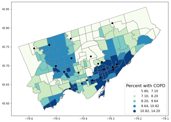
Q Reading the code in the cell above the map, what do the red points represent?
ANS: covid-19 testing sites
Q The data scientist wants to make a figure with two maps, with 2 rows and 1 column. Rewrite this line to make that happen:
fig, axes = plt.subplots(1,1, figsize = (12,8)
ANS: fig, axes = plt.subplots(2,1, figsize = (12,8)
Q When we create the plot using nbrhd_simple.plot, to place a map or graph in the first of two axes, what would you put following the parameter ax = ?
ANS: axes[0]
join_left_df = nbrhd_simple.sjoin(covid19sites, how="left", predicate = "contains")
no_duplicates_gdf = join_left_df.copy()
no_duplicates_gdf = no_duplicates_gdf.drop_duplicates('neighbID')
testingsite_present = no_duplicates_gdf["index_right"] >= 0
testingsite_present.value_counts()
testingsite_not_present = no_duplicates_gdf["index_right"].isnull()
testingsite_not_present.value_counts()

columns_to_keep = ["name","neighbID","onMarg","percent_copd","index_right","geometry"]

#create our final analysis geodataframe and create a column 'rail_present' that is true
#if railways are in the neighbourhood and false if not:
final_toronto_analysis = no_duplicates_gdf[columns_to_keep].copy()
final_toronto_analysis.loc[testingsite_present, 'testing_site_present'] = 1
final_toronto_analysis.loc[testingsite_not_present, 'testing_site_present'] = 0
final_toronto_analysis.head()
| name | neighbID | onMarg | percent_copd | index_right | geometry | testing_site_present | |
|---|---|---|---|---|---|---|---|
| 0 | Casa Loma (96) | 96 | 2.0 | 7.7 | NaN | POLYGON ((-79.41469 43.67391, -79.41485 43.674... | 0.0 |
| 1 | Annex (95) | 95 | 1.8 | 8.6 | NaN | POLYGON ((-79.39414 43.66872, -79.39588 43.668... | 0.0 |
| 2 | Caledonia-Fairbank (109) | 109 | 2.4 | 11.0 | NaN | POLYGON ((-79.46021 43.68156, -79.46044 43.681... | 0.0 |
| 3 | Woodbine Corridor (64) | 64 | 2.0 | 12.2 | NaN | POLYGON ((-79.31485 43.66674, -79.31660 43.666... | 0.0 |
| 4 | Lawrence Park South (103) | 103 | 1.0 | 6.7 | NaN | POLYGON ((-79.41096 43.70408, -79.41165 43.703... | 0.0 |
from statsmodels.formula.api import ols

regmod = ols('percent_copd ~ onMarg + testing_site_present', data = final_toronto_analysis) # setup the model
regmod_fit = regmod.fit()
print(regmod_fit.params)
print("rsquared: ",regmod_fit.rsquared)
Intercept               6.588549
onMarg                  0.979627
testing_site_present    0.192023
dtype: float64
rsquared:  0.08388954348277133
copd_summary = regmod_fit.summary()

copd_summary.tables[1]
| coef | std err | t | P>|t| | [0.025 | 0.975] | |
|---|---|---|---|---|---|---|
| Intercept | 6.5885 | 0.705 | 9.350 | 0.000 | 5.195 | 7.982 |
| onMarg | 0.9796 | 0.290 | 3.379 | 0.001 | 0.406 | 1.553 |
| testing_site_present | 0.1920 | 0.470 | 0.408 | 0.684 | -0.738 | 1.122 |
Q
State which variables are the dependent and independent variables in the regression model regmod. (3 marks)
ANS: onMarg, testing_site_present are independent variables, and percent_copd is the dependent variable.
Q
Write out the regression equation given the intercept and coefficient values from the regression model regmod. (4 marks)
ANS: y = 6.588549 + (x1 * 9.79627) + (x2 * 0.1920) - 1 point for intercept b1 and b2 each, 4 points if all are correct
Q Does the regression model indicate a positive or negative relationship between percent COPD and onMarg? What about percent_copd and testing_site_present? What does the r-squared value tell us about the relationship between our two variables? Briefly explain. (5 marks)
ANS: The regression model indicates there is a positive and significant relationship between percent_copd and onMarg.(2 points) There is no significant relationship between percent_copd and testing_site_present (2 points). The r-square indicates the model is poorly fit. (1 point)
