Class 12#
April. 1, 2024#
By the end of this class, you’ll be able to:
Conduct spatial clustering analysis
Final exam#
Place: Bahen Centre for Information Technology; BA 3175, BA 3185, BA 3195, BA 2200, BA 2220. We will release the room assignment later.
Time: April 21, 2:00PM - 5:00PM
Format: In-person, open-book. You will have access to the course website, JupyterHub, and MarkUs, which stores the course Notebook and your submitted assignments. You cannot take other materials to the exame, such as papers and your personal electronics.
Content: All course materials from week 1 to week 12
Practice: A final exam practice will be held around one week before the exam.
Question for the final project?
Templete
Submission: one single notebook with link to your presentation video; datasets you used for the notebook with the original names.
Read the instruction carefully regarding the deliveries and rubrics.
Review of clustering#
What is clustering?#
Clustering, generally, is the act of grouping similar things with eachother.
We can do this with non-spatial data as well as spatial data.
Spatial clustering, at a high level, is doing the same thing but one attribute to consider is geography.#
Spatial clustering involves looking at:
how some attribute is expressed across space;
whether similar attribute values are near each other.
Autocorrelation#
Autocorrelation literally means ‘self correlations’.
So instead of looking at how two attributes relate to each other (e.g., regression), we want to explore one a single attribute relates to its neighbours.
Typically, we’re talking about temporal autocorrelation or spatial autocorrelation.
Spatial Autocorrelation#
How does a variable value in a specific location correlate with the variable values in its neighbours?
regress a value on the values of its neighbours!
1) For each observation (in this case, neighborhood) we need to know their neighbours!#
To do this we can create something known as a ‘weights matrix’.
A weights matrix is a matrix that describes whether or not any one observation is ‘neighbours’ with another.
There are many ways we can do this, but let’s focus on two common ones: queen’s contiguity matrix and the rook’s contiguity matrix:
Queen’s contiguity matrix define the neighbors as either shared edges or nodes, while rook’s contiguity defines the neighbors as shared edges
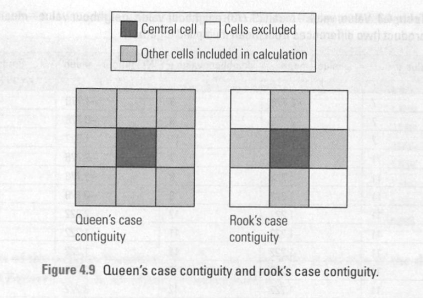
Think about: why the weights matrix can represent contiguity of neighbourhoods?
2) Next we need to describe the value of our attribute of interest in neighbours#
To do this we create a variable known as ‘spatial lag’.
Spatial lag for neighbourhood i is often just the average of some attribute value across all of neighbourhood i’s neighbours (as determined by our weights matrix!).
3) Finally, now we can see how a neighbourhood’s attribute compares to its neighbours.#
This set up allows us to see if neighbourhood’s with high attribute values are next to other neighbourhoods with high values.
We can then use a number of statistical tests to determine if there are ‘significant’ clusters in our dataset.
Conducting spaital clusering analysis#
Let’s see if we have spatial clusters in:
the percent of adults with asthma in Toronto
a random column of numbers
Step 1: import and merge health DataFrame with Toronto’s GeoDataFrame#
We have done this so many times! Let’s do it one more time.
# Import packages
import geopandas as gpd
import pandas as pd
# Import and clean neighborhood geodata

nbrhd = gpd.GeoDataFrame.from_file("Toronto_Neighbourhoods.geojson")
important_spat_cols = nbrhd.columns[[4, 5, 17]]
colnames_spat = {important_spat_cols[0]: 'nbrhd_name',
           important_spat_cols[1] : 'nbrhd_spat_id',
           important_spat_cols[2] : 'geometry'}
nbrhd_simple = nbrhd.copy()
nbrhd_simple = nbrhd_simple[important_spat_cols]
nbrhd_simple.rename(columns = colnames_spat, inplace=True)

# remember to change the data type of neighbor id
nbrhd_simple["Neighbid"] = nbrhd_simple["nbrhd_spat_id"].astype(int)
nbrhd_simple.head()
# Import and clean asthma data
fname = '1_ahd_neighb_db_ast_hbp_mhv_copd_2007.xls'
sname = '1_ahd_neighb_asthma_2007'
asthma_neighb = pd.read_excel(fname, sheet_name = sname, header = 11)
important_cols = asthma_neighb.columns[[0, 1, 10, 11]]
colnames = {important_cols[0] : 'Neighbid',
            important_cols[1] : 'name',
            important_cols[2] : 'adult_pop',
            important_cols[3] : 'asthma_pct'}
asthma_rates = asthma_neighb.copy()
asthma_rates = asthma_rates[important_cols]
asthma_rates.rename(columns = colnames, inplace=True)
asthma_rates.head()
# Merge the DataFrame to GeoDataFrame
nbrhd_asthma = nbrhd_simple.merge(asthma_rates, on="Neighbid")
nbrhd_asthma.head()
Before we start doing cluster analysis, we create a column of random numbers to our neighbor GeoDataFrame
This is to generate a random spatial pattern in our Toronto dataset.
We shouldn’t expect any spatial clusters in this random data
import numpy as np
import matplotlib.pyplot as plt

nbrhd_asthma['randNumCol'] = np.random.randint(1, 101, nbrhd_asthma.shape[0])

fig, axes = plt.subplots(1, 2, figsize = (12,12))
nbrhd_asthma.plot(column = "randNumCol", cmap = 'YlOrRd', scheme='quantiles', k=5, ax=axes[0])
nbrhd_asthma.plot(column = "asthma_pct", scheme='quantiles', k=5, cmap = 'YlOrRd', ax=axes[1])
axes[0].set_title("Random numbers", fontsize = 20)
axes[1].set_title("Asthma percentage", fontsize = 20);
Step 2: Identify the neighbours#
We will use the package libpysal to complete this task.
The neighbours of neighbourhoods are also knowns as “weight matrix”.
We will use the Queen’s contiguity weight.
Before creating weight matrix, we need to project the gdf into a projection coordinate system (e.g., Web Mercator). We will not cover it in detail in this class.
import libpysal as lps
# Reproject the gdf to 'Web Mercator'
nbrhd_asthma = nbrhd_asthma.to_crs("EPSG:3857")

# Create the spatial weights matrix
w = lps.weights.Queen.from_dataframe(nbrhd_asthma, use_index=False)

fig, axes = plt.subplots(1,1, figsize = (12,12))
# add nbrhd map
nbrhd_asthma.plot(ax = axes, edgecolor = 'black', facecolor = 'w')
# show what weights look like
w.plot(nbrhd_asthma, ax=axes,
        edge_kws=dict(color='r', linewidth=1),
        node_kws=dict(marker=''));
Let’s inspect the weights matrix further. What does it look like:#
w[0]
The first neighborhood has 5 neighbours: 128, 1, 133, 134, and 55
(And the weight of each neighbour is 1)
nbrhd_asthma['name'][[0,128,1,133,134,55]]
first_neighborhood = nbrhd_asthma.loc[[0]]
first_neighbors = nbrhd_asthma.loc[[128,1,133,134,55]]
fig, axes = plt.subplots(1,1, figsize = (12,12))
nbrhd_asthma.plot(ax = axes, edgecolor = 'black', facecolor = 'w')
first_neighborhood.plot(ax=axes, facecolor = 'b')
first_neighbors.plot(ax = axes, facecolor='r')
let’s see if Neighborhood No.128 is also connected to neighborhood No.0
w[128]
target_neighborhood = nbrhd_asthma.loc[[128]]
target_neighbors = nbrhd_asthma.loc[[0,16,4,134,55,62]]

fig, axes = plt.subplots(1,1, figsize = (12,12))
nbrhd_asthma.plot(ax = axes, edgecolor = 'black', facecolor = 'w')
target_neighborhood.plot(ax=axes, facecolor = 'b')
target_neighbors.plot(ax = axes, facecolor='r');
We can also look at the distribution of connections using the built in weights histogram function.
The first number is the count of connections and the second number is the number of neighbourhoods with this count of connections.
For example, there are 9 neighbourhoods with 3 connections, 13 with 4 connections, etc.
w.histogram
Finally, let’s ‘row standardize’ our matrix so that each nbrhd’s connections sum to one.
This is to calculate the average values of the neighbors.
# Row standardize the matrix
w.transform = 'R'

#how did this change things?
print('weights for nbrhd 0: ', w[0])
print('weights for nbrhd 128: ', w[128])
Step 3: Now that we have spatial weights established, we can calculate the average value of the neighbours of each neighbourhood, aka spatial lag.#
Let’s do that for the asthma percentage asthma_pct and for the random numbers randNumCol
# calculate the average of asthma_pct attribute of neighbours, then store in a new column

nbrhd_asthma['w_asthma_pct'] = lps.weights.lag_spatial(w, nbrhd_asthma['asthma_pct'])
nbrhd_asthma.head()
## Let's check how it works
## The Neighborhood No.0
print(nbrhd_asthma.loc[[128,1,133,134,55], 'asthma_pct'])

print("the average value of the Neighborhood No.0 is: ",nbrhd_asthma.loc[[128,1,133,134,55], 'asthma_pct'].mean())
Let’s look at a scatter plot between asthma_pct in each neighbourhood vs. the avg asthma_pct in their neighbors.
Recall our scatter plot in the regression class.
Keep in mind: we say spatial clustering is a kind of spatial autocorrelation, so the independent variable (x) is the target variable, while the dependent variable (y) is its spatial lag.
In other words, the value of a neighborhood can predict the values of its neighbors.
What relationships can you identify from the plot?
nbrhd_asthma.plot.scatter(x = "asthma_pct", y = "w_asthma_pct")
Let’s repeat the above, but for our random number column we created.
nbrhd_asthma['w_randNumCol'] = lps.weights.lag_spatial(w, nbrhd_asthma['randNumCol'])
nbrhd_asthma.plot.scatter(x = "randNumCol", y = "w_randNumCol")
So what do we see in the above two scatterplots?#
As
asthma_pctin a specific neighbourhood gets larger, the average value ofasthma_pctin that neighbhourhood’s neighbours (gets smaller/gets bigger/doesn’t change).As
randNumColin a specific neighbourhood gets larger, the average value ofrandNumColin that neighbhourhood’s neighbours (gets smaller/gets bigger/doesn’t change).
fig, axes = plt.subplots(1, 2, figsize=(15,5))
nbrhd_asthma.plot.scatter(x = "asthma_pct", y = "w_asthma_pct", ax=axes[0])
nbrhd_asthma.plot.scatter(x = "randNumCol", y = "w_randNumCol", ax=axes[1])
Step 4: Test the spatial autocorrelation#
from statsmodels.formula.api import ols
reg_asthma = ols('w_asthma_pct ~ asthma_pct', data = nbrhd_asthma).fit()
reg_asthma_sum = reg_asthma.summary()
reg_asthma_sum.tables[1]
reg_random = ols('w_randNumCol ~ randNumCol', data = nbrhd_asthma).fit()
reg_random_sum = reg_random.summary()
reg_random_sum.tables[1]
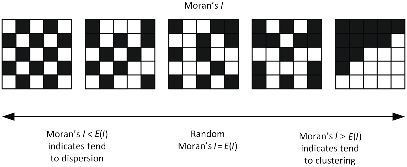
A more straightforward measurement: Moran’s I#
Moran’s I is global spatial autocorrelation statistic that tells us if high values are next to high values and low values are next to low values.
There is also a way to determine if this occurs at a significan level - e.g., does this sorting happen more than expected if the values were randomly spread across our study area.
The value of Moran’s I ranges from -1 to 1, where I of 1 is perfectly clustered and -1 is perfectly ‘dispersed’ (clustered and dispersed are two typical spatial patterns)
Ho (null hypothesis) = the values of asthma_pct are randomly distributed across our study area
Ha (alternative hypothesis) = the values of asthma_pct are not randomly distributed
If our p value is < 0.05 we will reject our null hypothesis Ho
We will use a new package esda “Exploratory Spatial Data Analysis” to calculate Moran’s I.
Another package splot is to visualize the output.
The pacakage automatically calculate the spaital lag using our spatial weight matrix w.
You can also find more inforamtion of Moran’s I here. Roughly speaking, Moran’s I is a spatially weighted autocorrelation statstic.
You can also relate the process to do a regression between the targe variable and its spatial lags, while the Moran’s I is very close to the correlation coefficient (but not exactly the same!)
The regression of the spatial lag w_asthma_pct on the attribute asthma_pct shows significantly possive associaiton.
The significant and positive coefficient indicates a high possibility of significant Moran’s I, and that its value may be >0 (clustering).
import esda
import splot
from splot.esda import moran_scatterplot

mi = esda.Moran(nbrhd_asthma['asthma_pct'], w)

print('The Morans I value is: ', mi.I)
print('The p-value of this Morans I value is: ', mi.p_sim)

#visualize!
splot.esda.moran_scatterplot(mi)
The Moran’s plot shows us the same scatter we saw before except now they’ve standardized the variable value and the spatial lag values (aka made them z-scores, where 0 is average).
We can furtherly break the scatterplot into 4 quadrants - going counter clockwise, starting from the upper-right.
The upper right is the ‘high-high’ quadrant, where high values in a nbrhd are next to neighbours with high values (quadrant 1)
The upper left is the ‘low-high’ quadrant, where low values in a nbrhd are next to neighbours with high values (quadrant 2)
The lower left is the ‘low-low’ quadrant (quadrant 3)
The lower right is the ‘high-low’ quadrant (quadrant 4)
If most points in our scatterplot are in the high-high and low-low quadrants we probably have clustering.
If they are mostly in the low-high and high-low then there’s likely dispersal.
If there is no obvious pattern, then there’s no sptial pattern - random distributed!
Let’s do it again with the random numbers column#
mi_randNumCol = esda.Moran(nbrhd_asthma['randNumCol'], w)

print('The Morans I value is: ', mi_randNumCol.I)
print('The p-value of this Morans I value is: ', mi_randNumCol.p_sim)

#visualize!
splot.esda.moran_scatterplot(mi_randNumCol)
# Make the comparison
fig, axes = plt.subplots(1,2, figsize = (12,12))
splot.esda.moran_scatterplot(mi, ax=axes[0])
splot.esda.moran_scatterplot(mi_randNumCol, ax=axes[1])

axes[0].set_title("Asthma percentage", fontsize = 20)
axes[1].set_title("Random numbers", fontsize = 20);
Local Spatial Autocorrelation#
Step 5: identify the clusters#
When Moran’s I is significant (i.e., <0.05), we can say there is a significant spatial autocorrelation for the variable.
More specifically, we can say there is a pattern of spatial clustering (Moran’s I significant and >0) of asthma percentage in Toronto neighborhooods!
But WHERE are the clusters?
We can use a different statistic to identify significant incidents of the clusters, i.e., local indicators of spatial autocorrelation (LISA).
This tells us exactly where on the map this clustering is happening!
We can think about the Moran’s I plots to help us here.
Using a new function we can identify which quadrant each neighbourhood is in, and if the relationship to neighbourhing values is strong enough to be significant.
For our case, those observations in quadrant 1 and 3 are ‘clustered’ and those in 2 and 4 would be ‘outliers’.
print('The Morans I value is: ', mi.I)
print('The p-value of this Morans I value is: ', mi.p_sim)
splot.esda.moran_scatterplot(mi)
The Moran_Local function help us to generate a statistic for each neighbourhood.
We want to name the reult as lisa, because lisa (local indicators of spatial association).
lisa = esda.Moran_Local(nbrhd_asthma['asthma_pct'], w)
It has two attributes: .p_sim store the significace, .q store which quadrant the neighbourhoods belong to.
# Break observations into significant or not
nbrhd_asthma['significant'] = (lisa.p_sim < 0.05)

# Store the quadrant they belong to
nbrhd_asthma['quadrant'] = lisa.q
nbrhd_asthma[['asthma_pct','w_asthma_pct','significant','quadrant']].head(10)
We can use a built in function in splot to plot the results.
Here, the “HH” means “High-High”, i.e., high values surrounding by high values;
“HL” means “High-Low”… “ns” means “no significnat”.
from splot.esda import lisa_cluster
splot.esda.lisa_cluster(lisa, nbrhd_asthma)
Let’s use what we learned before to plot the result of local autocorrelation.
# Setup the figure and axis
fig, axes = plt.subplots(1,1, figsize=(12, 12))
category_colors = {
    "HH": "red",
    "LL": "blue",
    "LH": "lightblue",
    "HL" : "salmon",
    "ns": "white"
}

# Plot insignificant clusters
ns = nbrhd_asthma.loc[nbrhd_asthma['significant']==False, 'geometry']
ns.plot(ax=axes, color=category_colors['ns'], edgecolor='grey')

# Plot HH clusters
hh = nbrhd_asthma.loc[(nbrhd_asthma['quadrant']==1) & (nbrhd_asthma['significant']==True), 'geometry']
hh.plot(ax=axes, color=category_colors['HH'], edgecolor='grey')

# Plot LL clusters
ll = nbrhd_asthma.loc[(nbrhd_asthma['quadrant']==3) & (nbrhd_asthma['significant']==True), 'geometry']
ll.plot(ax=axes, color=category_colors['LL'], edgecolor='grey')

# Plot LH clusters
lh = nbrhd_asthma.loc[(nbrhd_asthma['quadrant']==2) & (nbrhd_asthma['significant']==True), 'geometry']
lh.plot(ax=axes, color=category_colors['LH'], edgecolor='grey')

# Plot HL clusters
hl = nbrhd_asthma.loc[(nbrhd_asthma['quadrant']==4) & (nbrhd_asthma['significant']==True), 'geometry']
hl.plot(ax=axes, color=category_colors['HL'], edgecolor='grey')

# Style and draw
## Legend (inspired by ChatGPT)
import matplotlib.patches as mpatches
legend_patches = [mpatches.Patch(facecolor=color, edgecolor = 'grey', label=category) for category, color in category_colors.items()]
axes.legend(handles=legend_patches, title="Cluster Type", loc="lower right", title_fontsize = 15, fontsize = 12)
## Title
axes.set_title("Local cluster of asthma", fontsize = 23)
Finally, one more built in plot if you want!
It automatcially plot the local Moran’s I scatter (the Moron’s I plot but identify the significant neighbourhoods);
the types and locations of the significant neighbourhoods;
and the choropleth of the original variable in 5 quantiles (the asthema percentage)
from splot.esda import plot_local_autocorrelation
splot.esda.plot_local_autocorrelation(lisa, nbrhd_asthma, 'asthma_pct')
Finally finally, let’s look at what the random number col looks like…
Even random distributions of data across space will sometime generate local clusters.
Does these local clusters make sense?
It’s always good to consider the GLOBAL and LOCAL measures of spatial autocorrelation…
lisa_randNumCol = esda.Moran_Local(nbrhd_asthma['randNumCol'], w)
splot.esda.plot_local_autocorrelation(lisa_randNumCol, nbrhd_asthma, 'randNumCol')
One more thing – spatial correlation?#
We have identified a negative relationship between asthma prevalence and immigration rate.
We have also found a spatial cluster pattern of asthma rate.
Will immigration rate also be spatially clustered?
Do these two variables share similar spatial patterns?
(Source: Lee, 2001)
Exercise time!#
(Solusion will be available next Monday)