Class 10#
Mar. 18, 2024#
By the end of this class, you’ll be able to:
Fit linear regression;
Know what is spatial data;
Learn a new package geopandas;
Do some basic spatial analysis (we’ll learn more in next 2 weeks!)
Example of linear regression#
What is the effect of recent immigration on asthma rates in Toronto neighbourhoods?#
Data#
Data from http://torontohealthprofiles.ca contains data on asthma and immigration for each neighbourhood in Toronto.
Sociodemographic data#
Read sociodemographic data from the excel file
1_socdem_neighb_2006-2.xlswith sheet namesocdem_2006intopandasusingread_excel.
import pandas as pd
import matplotlib.pyplot as plt
import numpy as np
import seaborn as sns
from statsmodels.formula.api import ols
fname = '1_socdem_neighb_2006-2.xls'
sname = 'socdem_2006'
socdem_neighb = pd.read_excel(fname, sheet_name = sname, header = 10) # the table starts in row #11
socdem_neighb.head()
Which column should we select to measure immigration? There are several choices.
socdem_neighb.columns
Let’s use
'% Recent immigrants-within 5 years'to represent recent immigrants in a neighborhood.Later on we will want a few more sociodemographic columns, so let’s create a new
DataFrameand rename the columns.
cols = ['Neighbourhood id', 'Neighbourhood Name',
        'Median household income after-tax $ ‡',
        '% Rented Dwellings', '% Unemployment rate *',
        '% Recent immigrants-within 5 years', '% Visible minority']

socdem_neighb = socdem_neighb[cols]

colnames = {cols[0] : 'Neighbid',
            cols[1] : 'name',
            cols[2] : 'median_income',
            cols[3] : 'rented_dwell',
            cols[4] : 'unemployment',
            cols[5] : 'immigration5',
            cols[6] : 'vismin'}

socdem_neighb = socdem_neighb.copy()

socdem_neighb.rename(columns = colnames, inplace = True)
socdem_neighb.head()
Asthma data#
Read data from the excel file
1_ahd_neighb_db_ast_hbp_mhv_copd_2007.xlswith sheet name1_ahd_neighb_asthma_2007intopandasusingread_excel.
fname = '1_ahd_neighb_db_ast_hbp_mhv_copd_2007.xls'
sname = '1_ahd_neighb_asthma_2007'

asthma_neighb = pd.read_excel(fname, sheet_name = sname, header = 11) #the table starts with row #12
asthma_neighb.head()
The asthma rates are broken down by sex and age.
Which rates should we choose?
For this example, let’s select asthma rates for both sexes age 20 - 64.
asthma_neighb.columns
# Select the neghborhood_id, neighborhood_name, and both sexes with asthma

important_cols = asthma_neighb.columns[[0, 1, 11]]

colnames = {important_cols[0]: 'Neighbid',
           important_cols[1] : 'name',
           important_cols[2] : 'asthma_pct'}

asthma_rates = asthma_neighb.copy()

asthma_rates = asthma_rates[important_cols]

asthma_rates.rename(columns = colnames, inplace=True)

asthma_rates.head()
Merge Sociodemographic and asthma data#
To examine the relationship between asthma and immigration we will need to merge
socdem_neighbandasthma_rates.The
DataFrames can be merged on neighbourhood id.
# Two datasets are merged based on neighborhood id

asthma_socdem = asthma_rates.merge(socdem_neighb, on=['Neighbid', 'name'])

asthma_socdem.head()
A regression model of asthma on immigration#
Plot the data#
What are the dependent and independent variables?
Does the relationship look linear?
sns.regplot(y = 'asthma_pct', x = 'immigration5', data = asthma_socdem, ci = None);
# sns.regplot(y = 'asthma_pct', x = 'immigration5', data = asthma_socdem, ci = 95);
Describe the relationship between asthma and immigration.
Fit the regression model#
reg_asthmaimm = ols('asthma_pct ~ immigration5', data = asthma_socdem) # setup the model

reg_asthmaimm_fit = reg_asthmaimm.fit() # estimate/fit the model
Statistical summary of the regression model#
reg_asthmaimm_summ = reg_asthmaimm_fit.summary()

reg_asthmaimm_summ.tables[1]
The regression model is the equation:#
The slope indicates that for a 1% increase in immigration in the past 5 years the percentage of asthma cases in a neighbourhood decrease by 0.1597%.
The y-intercept indicates that when a neighbourhood has 0% immigration the past 5 years then asthma rates are 11%.
Are there any neighbourhoods with 0% immigration in the past 5 years?
asthma_socdem['immigration5'].describe()
The y-intercept in regression models often doesn’t have a sensible interpretation, but is often mathematically important for regression to work well.
Accuracy of the regression model#
reg_asthmaimm_fit.rsquared
plt.scatter(x = reg_asthmaimm_fit.fittedvalues , y = reg_asthmaimm_fit.resid)
plt.axhline(y = 0)
plt.xlabel('fitted values')
plt.ylabel('residuals')
The R-squared statistics indicates a relatively good explanation of the model (quite larger than 0)
The residual plot indicates some important variables are missing, as we can see larger abolute values as fitted values increase (not a random distributed pattern)
data = {'depvar' : np.arange(start = 0, stop = 10, step =0.1),
        'indvar' : np.arange(start = 0, stop = 10, step =0.1) + np.random.uniform(low = 0, high = 2, size = 100)}
df_sim = pd.DataFrame(data)
regmod_sim = ols('depvar ~ indvar', data = df_sim).fit() # setup the model
plt.scatter(x = regmod_sim.fittedvalues , y = regmod_sim.resid)
plt.axhline(y = 0)
plt.xlabel('fitted values')
plt.ylabel('residuals')
Summary#
Therefore, we can conclude that the immigration rate in recent 5 years in a neighborhood is negatively associated with the prevalence of asthma in the neighborhood.
Why not causal relationship?
What is the implication?
Training and testing a model#
Ideally we could assess the accuracy of this linear regression model on a new set of data (i.e., immigration rates in Toronto neighbourhoods in future years.)
But, we don’t have this data.
One trick that data scientists use to fit the model on part of the data (training data) and use the remaining part (testing data) to test the accuracy.
If we only have one data set then the training data can be obtained by randomly selecting rows from the data to fit the regression model, then the remaining rows can be used to test the accuracy of the model.
Splitting a pandas DataFrame by index#
data = {'a' : [1, 2, 3, 4, 5]}

df = pd.DataFrame(data)

df.index
A Boolean array that is True if the index is 0 or 1 and False otherwise.
df.index.isin([0,1])
df[df.index.isin([0,1])]
To create a Boolean series that is False if the index is 0 or 1 and True otherwise we can negate df.index.isin([0,1]) this Boolean series using the ~ operator ~df.index.isin([0,1])
~df.index.isin([0,1])
df[~df.index.isin([0,1])]
Creating training and test data sets from a single dataset#
Step 1:#
split the data into a training set with 75% of the rows.
use the remaining 25% of the data for testing.
np.random.seed(11) # for reproducibility

# randomly select 75% of neighbourhoods
reg_df_train = asthma_socdem.sample(frac = 0.75, replace = False)

# get index of training data
train_index = reg_df_train.index
Exclude indicies from
reg_df_trainusingpandasisinfunction.
# exclude rows in training to define test data
reg_df_test = asthma_socdem[~asthma_socdem.index.isin(train_index)]

print(asthma_socdem.shape)

print(reg_df_train.shape)

print(reg_df_test.shape)
Step 2: Fit the regression model on the training data#
reg_train = ols('asthma_pct ~ immigration5', data = reg_df_train) # setup the model

reg_train_fit = reg_train.fit() # estimate/fit the model
Step 3: Compute fitted values using training data#
# use the model fit on the training data to predict asthma rates
# from the test set.

predvalues_train = reg_train_fit.fittedvalues
Step 4: Evaluate accuracy using root mean-squared error on training data#
Another measure of accuracy of regression models.
Compares observed values of the dependent variable with the predicted values.
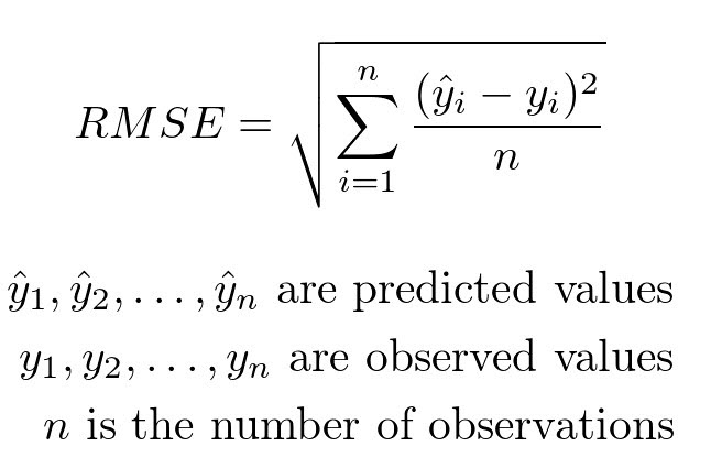
It can be computed using the rmse function from statsmodels.
# Compute root mean-squared error for the training data.
from statsmodels.tools.eval_measures import rmse

rmse(predvalues_train, reg_df_train['asthma_pct'])
The observed asthma rates deviate from the predicted asthma rates in each neighbourhood by 1.4% in the training set.
Is this an acceptable prediction error?
Let’s examine the accuracy of the linear regression model on the test set
Step 5: Evaluate the accuracy of regression model on the test data using root mean-squared error#
Compute predictions using test data
predvalues_test = reg_train_fit.predict(reg_df_test['immigration5'])
Now compute the root mean-squared error for the test data using the model fit on the training data.
rmse(predvalues_test, reg_df_test['asthma_pct'])
Conclusion of data analysis using linear regression model#
The regression model appears to provide an accurate fit the data, although both the scatter plot and plot of residuals indicate that there is a lot of variation in asthma rates in neighbourhoods when the immigrations rates are small (between 10%-20%).
As the percentage of immigrants to a neighbourhood within the last 5 years increases, the asthma rates will decreases.
Regression analyses on aggregated data such as neighbourhoods can be misleading when compared to non-aggregated data.
Are there other sociodemographic factors in our data that might effect asthma rates?#
Let’s create a matrix scatter plot using
pairplotin theseabornlibrary.pairplotwill visualize paired relationship between variables in a dataset.
asthma_socdem.columns
# reduce the column for better presentation
to_show = ['asthma_pct','median_income','rented_dwell','immigration5','vismin']
sns.pairplot(asthma_socdem[to_show]);
Let’s consider median income
Fit the regression model on all the data and produce a statistical summary.
reg_asthmaimmunem = ols('asthma_pct ~ immigration5 + median_income', data = asthma_socdem) # setup the model

reg_asthmaimmunem_fit = reg_asthmaimmunem.fit() # estimate/fit the model

reg_asthmaimmunem_summ = reg_asthmaimmunem_fit.summary()

reg_asthmaimmunem_summ.tables[1]
Notice that the slope estimate (coefficient) for
median_incomeis 0, but so is the p-value and range of plausible values.That seems odd. What’s happening?
We can see from the scatter plot that
immigration5andmedian_incomehave a linear relationship.When two variables have a linear relationship multiple linear regression models produce strange results.
It is called multicollinearity issue.
It’s important that independent variables in a multiple regression model are unrelated.
sns.regplot(y = 'immigration5', x = 'median_income', data = asthma_socdem, ci = None);
A quick review of linear regression#
Step 1: prepare data (Which dataset I want to import? Which variables I want to analyze? How I can ‘wrangle’ the data, i.e., produce new variables and merge them into one dataframe for further analysis?)
Step 2: Explore pair relationship (Using
sns.pairplotto explore potential relationships. Is there a linear relationship?)Step 3: Fit model
Step 4: Accuracy (Which indicators I want to use? e.g., r-squared, residual plot, RMSE)
Step 5: Display the full model and explain (What does the model mean?)
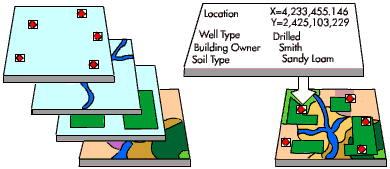
Introduction to spatial data#
Why Spatial Data Matters#
What are spatial data?#
Spatial data are data that have some geographic attribute(s). So you can think of it like each row having a pointer to where the row goes on a map.
Why do we want spatial data?#
By locating things on a map, we can look for how certain variables present vary across space. We can look for things like clustering of high values or cold spots (aka hot spots/cold spots) or dispersal. Patterns across space can reveal interesting drivers of social phenomena.

Types of Spatial Data#
raster data & vector data#
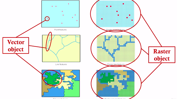
Raster data#
For example, satellite and aerial images

Vector data#
For example, points, lines, and polygons

How are these data stored in a computer?#
There are many ways!
Generally raster data are stored as a matrix#

Vector data is stored in many different ways…#
Two common ones are geojson and shapefiles.
What are these files made of?
Geojson is pretty straightforward:

Shapefiles are more complicated and involve multiple distinct files that contain information about spatial locations, coordinate systems and projections, attributes, etc. We’ll focus on geojson for this class.
Introducing GeoPandas#
How do we work with spatial data in python?#
We’re going to use something called ‘geopandas’
https://geopandas.org/en/stable/
There are a few other libraries that we need, like mapclassify. There are a lot of different tools out there, but we’ll stick to these two (and the xls reader) for today
# # Let's install and then load libraries
# import sys
# !{sys.executable} -m pip install geopandas
# !{sys.executable} -m pip install mapclassify
# !{sys.executable} -m pip install xlrd
import pandas as pd
import geopandas as gpd
import matplotlib.pyplot as plt
import mapclassify
import xlrd
Now we want to import a spatial data file.#
We’ll be working with two spatial data files today:
Toronto_Neighbourhoods.geojson and toronto_rails.geojson
We’ll also use the health data we were playing with last week:
1_ahd_neighb_db_ast_hbp_mhv_copd_2007.xls
To load the spatial data we need to create something known as a geodataframe:#
nbrhd = gpd.GeoDataFrame.from_file("Toronto_Neighbourhoods.geojson") ## Like pd.read_xxx(file_name)
nbrhd.head()
# Let's look at the geometry column - this is the data that
# describes the polygon representing the first neighbourhood

print(nbrhd.loc[0,'geometry'])
# Otherwise we can continue to treat the variable like a dataframe ...
# it's what we have been doing all along!

nbrhd_names = nbrhd["AREA_NAME"]
type(nbrhd_names)
Now if we want to make a map, what do we do?#
It’s easy! You can “plot” a geodataframe and geopandas will make it a map!
nbrhd.plot()
That’s nice…#
But we want to be a little more sophisticated with our maps.

The next cell goes through a better way to create a map “figure”.
Let’s first create Figure and Axes objects.
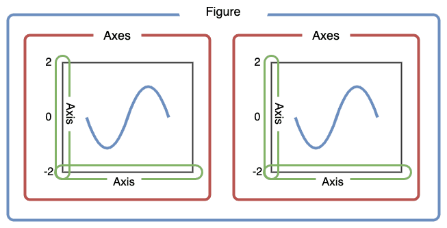
First, let’s use plt.subplots to create a figure variable “fig” and an axes variables called “ax”.
The first line of code sets the stage - it says how many images - by rows/columns, and we can set other figure attributes in here, like figure size using figsize.
To plot the map, we need to call the plot command .plot like before, but this time we want to say which ‘cell’ or ax cell it will go in, i.e., ax=axes. We also can use the column parameter to shade each row (that represents a polygon) by an attribute value.
fig, axes = plt.subplots(1, 1, figsize = (12,12))

print(type(fig)) #Figure object is like the sheet we are drawing on
print(type(axes))  #AxesSubplots are like cells within the sheet

nbrhd.plot(column = "AREA_NAME", ax = axes);
What if we want to do 2 maps in one figure?
fig, axes = plt.subplots(1, 2, figsize = (15,10))

#notice there are just 2 things in the axes object
print(axes.shape)

# pick the first cell in the figure
ax = axes[0]
nbrhd.plot(column = "AREA_NAME",
           ax=ax)

# pick the second cell in the figure
ax = axes[1]
nbrhd.plot(ax=ax)

#resize
current_fig = plt.gcf() #get current figure aka gcf
current_fig.savefig('torontomaps.png',dpi=100) #export maps as an image file!
A note about axes:
if you only has one ‘axes’ (i.e., plt.subplots(1,1)) then you can just say
ax = axesif you have a 1 row and multiple columns or multiple rows and 1 column, then you would say
ax = axes[n]wherenis the axes cell you’d like to put the figure inif you have a matrix of cells of axes (i.e., plt.subplots(2,2)) then you need to say
ax = axes[n][m]wherenis the row number andmis the column number of the cell
Let’s try with a column that contains a number… what happens there?#
let’s also add a new parameter “cmap” = color map and a legend.
This link will provide more info on other things we can do with plotting geodataframes: https://geopandas.org/en/stable/docs/reference/api/geopandas.GeoDataFrame.plot.html
fig, axes = plt.subplots(1,1, figsize=(10,10))

# We want to plot the area of each neighborhood
nbrhd.plot(column = "Shape__Area", ax = axes,
           cmap = "spring", legend = True) #viridis

current_fig = plt.gcf()
let’s try again with neighbourhoods:#
#another way to resize
fig, axes = plt.subplots(1,1, figsize = (15,15))


nbrhd.plot(column = "AREA_NAME", ax = axes,
           cmap = "Pastel1", legend = True)
… These are silly maps. Who cares how big the neighbourhoods are or who can deal with a weird pastel map with a legend that is way too big…
We want to know what is happening inside of them!#
How do we bring two pieces of info together? How do we bring data from a table into a geodataframe?
We can use joins! Remember those?
How do we bring data from a table into a geodataframe?#
We can use merge, just like what we did before!
Let’s join the asthma rates into the neighborhood and map them out.
# simplify the geodataframe ready

important_spat_cols = nbrhd.columns[[4, 5, 17]]
colnames_spat = {important_spat_cols[0]: 'area_name',
           important_spat_cols[1] : 'nbrhd_spat_id',
           important_spat_cols[2] : 'geometry'}

nbrhd_simple = nbrhd.copy()

nbrhd_simple = nbrhd_simple[important_spat_cols]

nbrhd_simple.rename(columns = colnames_spat, inplace=True)

# Notice that the "nbrhd_spat_id" is a string and not a number... that may be an issue
print("The data type of nbrhd_spat_id is: ", type(nbrhd_simple["nbrhd_spat_id"][0]))
nbrhd_simple.head()
#get the asthma data

fname = '1_ahd_neighb_db_ast_hbp_mhv_copd_2007.xls' #file name
sname = '1_ahd_neighb_asthma_2007' #sheet name in excel file

#store excel sheet with asthma data in a dataframe variable
asthma_neighb = pd.read_excel(fname, sheet_name = sname, header = 11)
asthma_neighb.head()
#let's simplify this by only pulling a few relevant columns
important_cols = asthma_neighb.columns[[0, 1, 11]]
colnames = {important_cols[0]: 'Neighbid',
           important_cols[1] : 'name',
           important_cols[2] : 'asthma_pct'}

asthma_rates = asthma_neighb.copy()

asthma_rates = asthma_rates[important_cols]

asthma_rates.rename(columns = colnames, inplace=True)

print("The data type of Neighbid is: ", type(asthma_rates["Neighbid"][0]))
asthma_rates.head()
Note that the nbrhd_spat_id in Neighborhood GeoDataFrame is string#
Let’s convert it into a number.
# Create a new variable in the nbrhd_simple geodataframe and store the new number
# version of the neighbourhood id here
nbrhd_simple["Neighbid"] = nbrhd_simple["nbrhd_spat_id"].astype(int)
print("The data type of Neighbid is: ", type(nbrhd_simple["Neighbid"][0]))
# we can sort by the id - and check to see if they line up with the asthma data
nbrhd_simple.sort_values('Neighbid').head()
nbrhd_simple.sort_values('Neighbid').tail()
asthma_rates.tail()
Now let’s do the join!#
nbrhd_simple = nbrhd_simple.merge(asthma_rates, on="Neighbid")
nbrhd_simple.head()
Now that we have merged our spatial data with our attribute data…#
we can plot the values using the geodataframe maps plotting capability#
#generate our figure/axes and set fig size
fig, axes = plt.subplots(1, 1, figsize = (12,12))

#let's map asthma percent rates across toronto!
nbrhd_simple.plot(column = "asthma_pct",
                  legend = True, ax = axes,
                  cmap = "YlOrRd")
Hmm - Looks like there are some spatial patterns!#
We can also look at non-spatial figures to explore our data. Doing this helps us understand the ‘shape’ of our data in different ways.
Let’s create a histogram of the same data in the following cell:
# Just like what we do in pandas
nbrhd_simple['asthma_pct'].hist(bins=8)

plt.xlabel('Asthma Percent')
plt.ylabel('Number of neighbourhoods')
plt.title('Distribution of percent of residents with asthma in Toronto, ON')
plt.show()
Interesting!#
This looks like a “normal” distribution:
Many neighbourhoods with values in the middle range, but some at the extremes (both low and high).
But when we look at the map, we notice that neighbourhoods with high values tend to be near other neighbourhoods with high values, and low value neighbourhoods near others with low values.
Maybe there is some spatial mechanism causing this!
To dig into this more, let’s classify the data using quartiles…#
To do this we add a scheme parameter to the plot function and use quantiles. the k value tells the plot function how many quantiles you want. We want four quantiles (0-25%, 25%-50%, 50%-75%, 75%-100%).
More information about plot function
We do this for a few reasons:
(1) It makes it easier to see groups with similar values that are close to eachother and
(2) it makes the legend easier to interpret.
Note that we also have added an edgecolor parameter which tells the map what color to outline neighbourhoods with.
fig, axes = plt.subplots(1,1, figsize =  (10,10))
nbrhd_simple.plot(column='asthma_pct', scheme='quantiles',
                  k=4, cmap='YlOrRd', edgecolor='black',
                  ax = axes, legend=True)
This map looks a lot better, I think! But the legend is overlapping the map. We should move it.
The legend options are kind of complicated, but you can find more about stuff here: https://matplotlib.org/3.5.1/api/_as_gen/matplotlib.pyplot.legend.html
I’m going to show you a few things you can do, like move the legend, adjust font size, and add a title:
fig, axes = plt.subplots(1,1, figsize =  (12,12))

nbrhd_simple.plot(column='asthma_pct', scheme='quantiles',
                  k=4, cmap='Greens', edgecolor='grey',
                  ax = axes, legend=True,
                  legend_kwds={'loc': 4, 'title': 'Percent Asthmatic',
                               'title_fontsize': 23,'fontsize': 15}) #'loc'=4 means lower right
Can we show descriptive stats charts next to a map?
Yes!
#First create a figure sheet with 2 axes cells (and resize the figure)
fig, axes = plt.subplots(1,2, figsize = (15,5))

#let's put the map in the first axes cell:
nbrhd_simple.plot(column='asthma_pct', scheme='quantiles',
                  k=4, cmap='Greens', edgecolor='grey', linewidth = 0.2, #notice I added linewidth to narrow the borders
                  ax = axes[0], legend=True,
                  legend_kwds={'loc': 4, 'title': 'Percent Asthmatic',
                               'title_fontsize': 10,'fontsize': 9})

#we can put the histogram we made earlier in the second axes cell:
nbrhd_simple['asthma_pct'].hist(bins=8, ax = axes[1])
plt.xlabel('Asthma Percent')
plt.ylabel('Number of neighbourhoods')
plt.title('Distribution of percent of residents with asthma in Toronto, ON')
First steps into “spatial analysis”…#
OK great! That chart is interesting and gets us thinking. But one of the powers of spatial analysis is relating environments to spatial phenomena.
Coordinate systems and projections#
When working with spatial data, you may need to think about coordinate systems and geographic projections.
Because we are taking data that exist on a sphere and laying them out flat on a plane, all spatial data is projected.
If you have two layers of spatial data it is always good to check that they are in the same projection, or else you will get errors or bad results.
If the files are not in the same projection, it’s pretty simple to convert one of the files to the same projection as the other file:
# double check coordinate systems - we always want to work in the same projection

print("The original projection of railways is: ", railways.crs)
print("The original projection of nbrhd_simple is: ", nbrhd_simple.crs)

# reproject railways so it's the same as our neighbourhood layer
railways = railways.to_crs(nbrhd_simple.crs) #we can just borrow the "crs" (coordinate reference system) from the other spatial file
print("The NEW projection of railways is: ", railways.crs)
print("And nbrhd_simple is still: ", nbrhd_simple.crs)
railways.plot()
nbrhd_simple.head()
Now that our two geodataframe spatial layers are in the same projection, we can plot them together#
We want to create 1 map and tell geopandas to put the two spatial layers in the same axes cell:
fig, axes = plt.subplots(1,1, figsize = (15,10))


nbrhd_simple.plot(column='asthma_pct', scheme='quantiles',
                  k=4, cmap='Greens', edgecolor='grey',
                  linewidth = .2, ax = axes, legend=True,
                  legend_kwds={'loc': 4, 'title': 'Percent Asthmatic',
                               'title_fontsize': 20,'fontsize': 15})

railways.plot(edgecolor="red", linewidth = .5, ax = axes) #notice i'm putting this in the same axes cell
Hmm - could there be something there?#
Maybe!
But what are the things that might be happening here?
Let’s do a “spatial join”#
What is a spatial join?
Basically, we are relating information from two tables that share a spatial relationship.
So information from layer a’s table will be joined with information from layer b’s table where the two intersect/touch/are within/etc.
We will use “intersect” here, but you can refer to the geopandas documentation to learn more:
https://geopandas.org/en/stable/gallery/spatial_joins.html
# Clean the railway dataframe
railways.columns
railways_simple = railways[['TRACKNID','geometry']] #'geometry' is always kept
join_left_df = nbrhd_simple.sjoin(railways_simple, how="left", predicate = "intersects")
join_left_df
join_left_df.loc[join_left_df['TRACKNID'].isnull()]
Woah!#
Now we have 2528 rows… that’s way more rows than neighbourhoods. What happened?
Spatial join creates a new row for every instance of ‘intersection’. So if railway 1 and railway 2 both go through neighbourhood a, then there will be two rows with neighbourhood a with one row joined with railway a data and the other joined with railway b data.
Also, notice that neighbourhoods that didn’t have any railway go through them were appended with NaNs. This is saying there is no data about railways for these neighbourhoods because there were none there.
Because we just want to know what neighbourhoods have ANY railway go through them, we can take the joined results and remove duplicate rows of each neighbourhood.
no_duplicates_gdf = join_left_df.copy()
no_duplicates_gdf = no_duplicates_gdf.drop_duplicates('Neighbid')
no_duplicates_gdf.shape
Let’s check this new, no duplicate geodataframe to see if looks right.#
We can plot the map using “index_right” which is the index from the railway layer. The values are meaningless, but it shows us where there ARE values and where there are not.
fig, axes = plt.subplots(1,1, figsize = (15,10))

no_duplicates_gdf.plot(column = "index_right", ax=axes)
railways_simple.plot(edgecolor="red", linewidth = .5, ax = axes)
This looks good, based on visual inspection#
But we need a column that tells us there IS or there IS NOT a railway in each neighbourhood. We can go back to some of the skills we learned earlier in the course to do this.
We will first create two series of TRUE and FALSE values to show where a value exists in the “index_right” column.
The series rail_present will be true if there is a value in the column - implying a railway goes through the neighbourhood, and false otherwise.
The series rail_not_present will be true if there is a NaN value in the row where the railway info is, and false otherwise.
rail_present = no_duplicates_gdf["index_right"] >= 0
rail_present.value_counts()
rail_not_present = no_duplicates_gdf["index_right"].isnull()
rail_not_present.value_counts()
Let’s clean things up a little and create the final geodataframe we want to work with#
We can clean things up and then create a map and a descriptive statistics plot to show our findings.
#create list of columns relevant to our analysis
columns_to_keep = ["name","Neighbid","asthma_pct","index_right","geometry"]

#create our final analysis geodataframe and create a column 'rail_present' that is true
#if railways are in the neighbourhood and false if not:
final_toronto_analysis = no_duplicates_gdf[columns_to_keep].copy()
final_toronto_analysis.loc[rail_present, 'rail_present'] = True
final_toronto_analysis.loc[rail_not_present, 'rail_present'] = False
final_toronto_analysis.head()
fig, axes = plt.subplots(1,2, figsize = (15,7))

final_toronto_analysis.boxplot(column="asthma_pct",
                               by = "rail_present",
                               ax = axes[0])

final_toronto_analysis.plot(column='asthma_pct', scheme='quantiles',
                  k=2, cmap='Greens', edgecolor='grey', linewidth = 0.2,
                  ax = axes[1], legend=True,
                  legend_kwds={'loc': 4, 'title': 'Percent Asthmatic',
                               'title_fontsize': 14,'fontsize': 11})
railways.plot(ax=axes[1], edgecolor='red',linewidth=0.5)

axes[0].set_title("")
axes[0].set_ylabel("Asthma Percent", fontsize = 15)
axes[0].set_xlabel("Rail Present?", fontsize = 15)

fig.suptitle("Percent of Population with Asthma for Neighbourhoods with Railways",
             fontsize = 20, fontweight = "bold")
It seems that the presence of railway in neighborhood is related to higher asthma rate!
But is it a significant relationship?
Remember the comparison between two groups before!
Let’s do a hypothesis testing using shuffling method.
Null hypothesis: There is no differences of asthma rates between neighborhoods with railways and without railways.
Alternative hypothesis: Neighborhoods with railways have higher asthma rates than the neighborhoods without railways.
Let’s do a exercise.
# Simulation
simulated_diffs = []

for _ in range(5000):
    simulated = final_toronto_analysis['rail_present'].sample(frac=1, replace = False).reset_index(drop = True)
    mean_railway = final_toronto_analysis.loc[simulated == True, 'asthma_pct'].mean()
    mean_norailway = final_toronto_analysis.loc[simulated == False, 'asthma_pct'].mean()
    sim_diff = mean_railway - mean_norailway
    simulated_diffs.append(sim_diff)

# Calculate observed difference
obs_mean_railway = final_toronto_analysis.loc[final_toronto_analysis['rail_present'] == True, 'asthma_pct'].mean()
obs_mean_norailway = final_toronto_analysis.loc[final_toronto_analysis['rail_present'] == False, 'asthma_pct'].mean()

obs_diff = obs_mean_railway - obs_mean_norailway

# Calculate p-value
simulated_diffs_df = pd.DataFrame({'sim_diffs' : simulated_diffs})

numgreater = (simulated_diffs_df['sim_diffs'] >= obs_diff).sum()
print('The number of simulated differences greater than the observed difference is:', numgreater)

numsmaller = (simulated_diffs_df['sim_diffs'] < -1 * obs_diff).sum()
print('The number of simulated differences smaller than the observed difference is:', numsmaller)

pvalue = (numgreater + numsmaller)/ 5000

print('The p-value is:', pvalue)
Great! We can say the asthma rates in neighborhoods with railways are significantly higher than the rates in neighborhoods without railways.
But is this a causal relationship?